
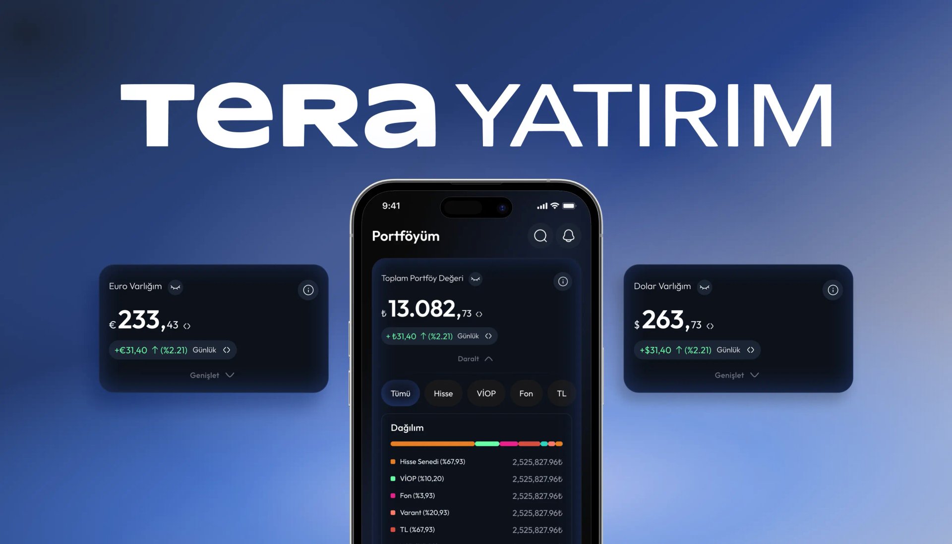
Tera Trader
We redesigned Tera Yatırım's mobile investment app with the user experience at its core. We reimagined every screen of Tera Trader for iOS and Android, creating two experience levels, Pro and Lite, with both light and dark themes.
Overview
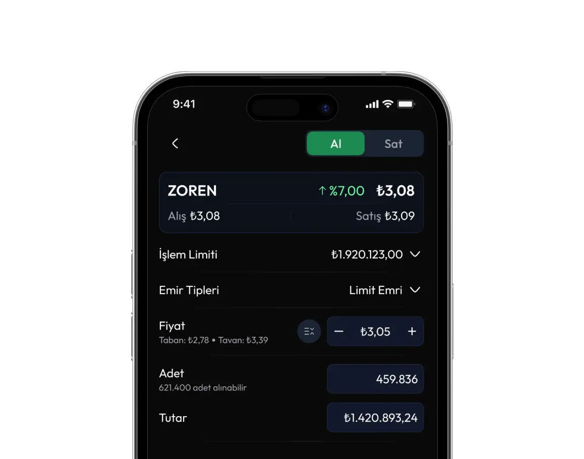
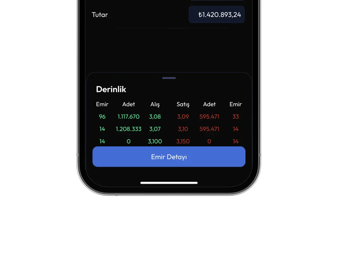
Tera Trader is the mobile investment application of Tera Yatırım, a company listed on Borsa İstanbul. The app covers a wide range of investment instruments, including equities, futures and options (VİOP), precious metals, and warrants. It offers real-time price tracking, order placement, market news, and portfolio monitoring.
At Neon Apps, we took responsibility for the app's UI/UX design, redesigning every screen for iOS and Android, from the home screen and watchlists to order management, alerts, and the IPO section.
The design phase is complete, and Tera Yatırım is continuing the development process.
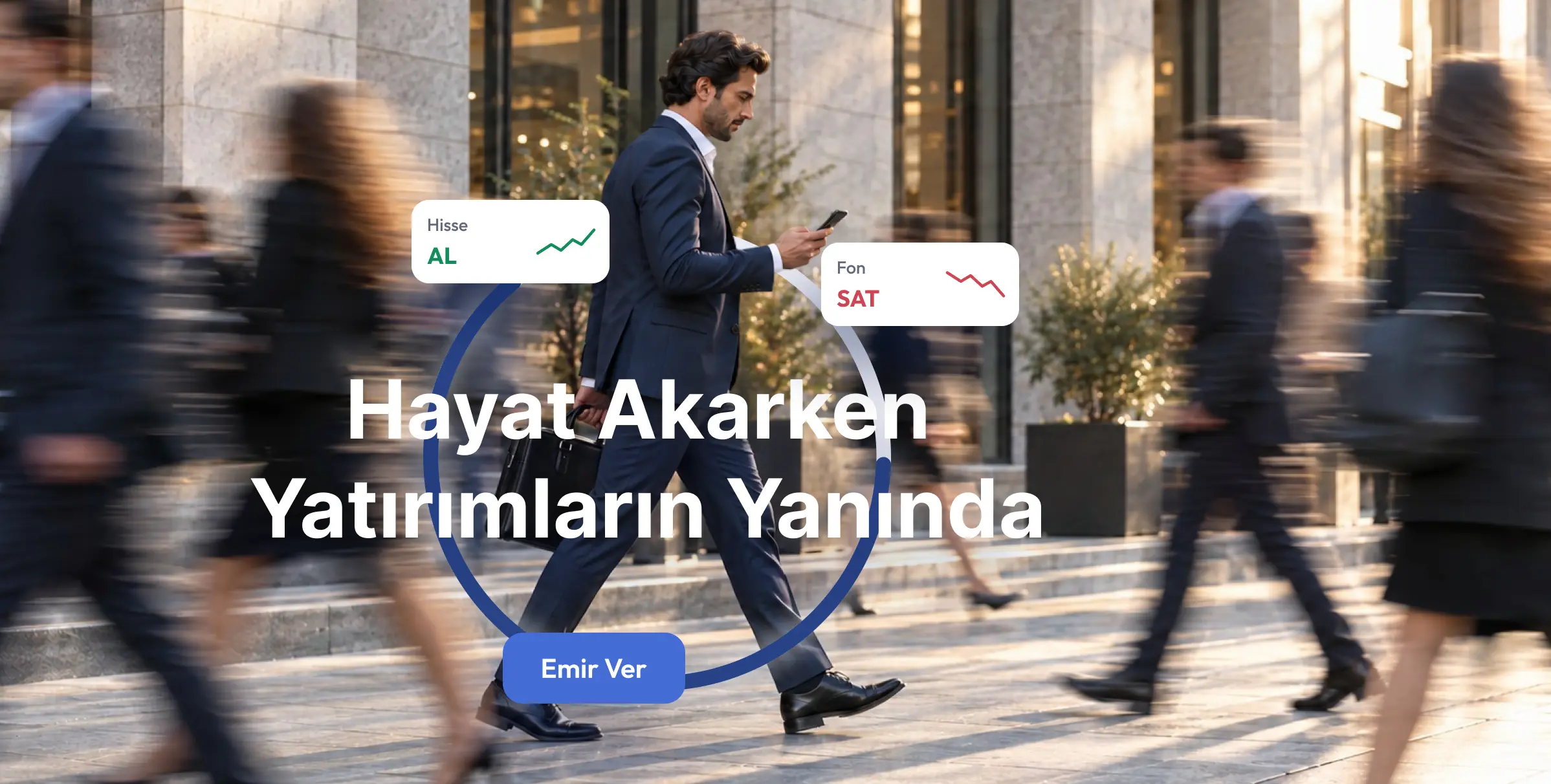
Market data came first. The user experience came second.
When investors open an investment app, they typically want to see how their portfolio is performing. However, Tera Trader's original home screen prioritized heatmaps and price tables, while personal account information remained hidden behind additional tabs.
First-time investors and experienced traders managing positions throughout the day were also presented with the same information-dense interface.
The challenge wasn't the range of features available. It was the experience users had in their very first moments with the app.
How did we define the scope?
We began the redesign by examining what users see the moment they open the app. From there, we explored how they access market information, personalize the assets they follow, and interact with the platform based on their experience and needs.
We redesigned the home screen to put users' own holdings first, with an option to hide account balances for greater privacy.
We also transformed watchlists into a more personalized experience. Users can name their lists, choose emojis, search for instruments by asset type, and add the assets they want to follow, including symbols listed on international exchanges.
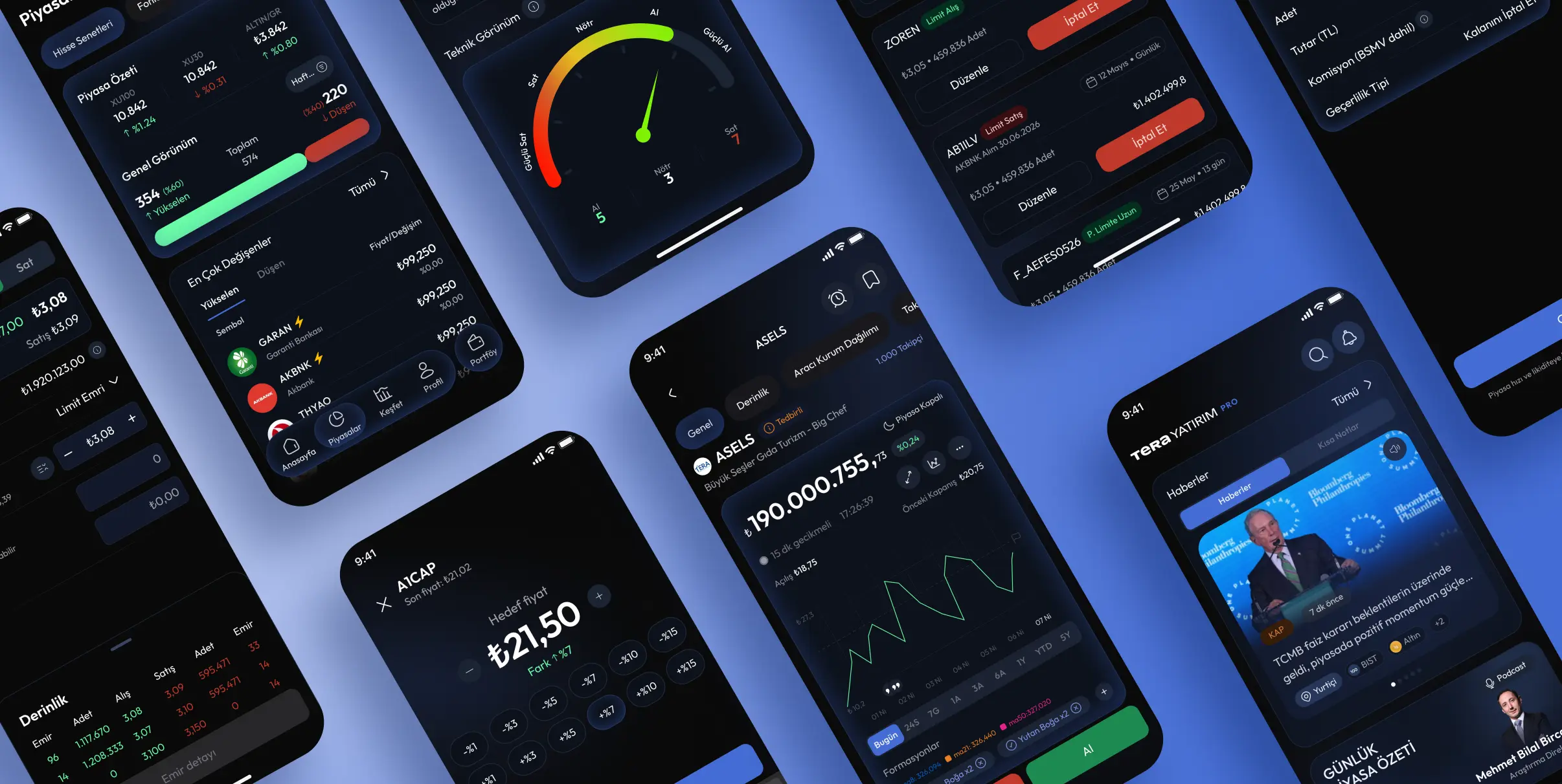
One design system, two experiences: Pro and Lite
Rather than treating Pro and Lite as two separate applications, we designed them as distinct experiences built on a shared design system.
Pro preserves the detailed information and trading functionality required by active investors, while Lite offers a simpler interface with fewer panels, built on the same underlying structure.
Both versions were designed with light and dark themes. By using shared components, we ensured that design updates could be applied consistently across all four combinations.
We also considered more than just ideal user journeys. Empty watchlists, restricted access, hidden balances, searches with no results, and watchlist limits were all included in the design process.
Frequently asked questions
Let's Connect
Got a project? We build world-class mobile and web apps for startups and global brands.
