



Skip to content
Neon Apps
The Tera Yatırım and Neon Apps logos locked up together on a navy background.

Case study · Tera Yatırım Menkul Değerler A.Ş.

Tera Trader - Tera Yatırım Menkul Değerler A.Ş.

Redesigning Tera Trader end to end. We reworked everything in Tera Yatırım’s mobile investment app, from the interface to the flows, for iOS and Android.

We redesigned Tera Trader, Tera Yatırım’s mobile investment app, from individual screens to whole flows, end to end for iOS and Android. Our goal was to preserve the app’s comprehensive investment capabilities while creating a more modern, intuitive and personalized experience for both first-time investors and active traders. We reworked every screen in the app, from the home screen and the watchlists to the order and price alert panels and the IPO section, and developed a unified design system supporting two experience levels, Pro and Lite, each available in light and dark modes.

In short

Tera Trader is the mobile investment application of Tera Yatırım, a publicly traded investment firm listed on Borsa Istanbul.

The app provides access to equities, futures and options on Borsa Istanbul’s Derivatives Market (VİOP), precious metals and warrants. Users can monitor real-time prices, place orders, access market news and manage their portfolios in one place.

Neon Apps was responsible for the app’s UI/UX design, redesigning the app from the home screen and watchlists to order panels, price alerts and the IPO section.

The scope covered iOS and Android, two experience levels (Pro and Lite), and light and dark modes for each.

Tera Trader has been available on the App Store since March 2023. The redesigned experience is currently in development.

The client

Tera Yatırım Menkul Değerler A.Ş. is an Istanbul-based brokerage firm offering mobile access to equities, derivatives, precious metals and warrant trading through Tera Trader.

Tera Yatırım was responsible for the investment products, market data, regulatory requirements and development of the application.

Neon Apps led the user experience and interface design, delivering a comprehensive design system for iOS and Android that accommodates different user needs and provides a practical foundation for implementation.

Why this project?

When investors open a trading app, one of their first priorities is often to see how their own portfolio is performing.

In Tera Trader’s existing experience, however, the first screen focused on general market data. Heatmaps and price tables offered valuable market insights, but users needed to navigate to other screens to access their personal investments.

At the same time, first-time investors and experienced traders were presented with the same interface. This created unnecessary complexity, particularly for users who were still becoming familiar with investing.

Tera Yatırım wanted more than a visual refresh. The goal was to create a modern, user-centered experience capable of competing with next-generation investment apps such as Midas.

The existing app already offered a comprehensive range of investment products and trading capabilities. Rather than adding more features, our focus was on making its existing functionality easier to access and understand.

This led us to design two experience levels: Pro and Lite. The approach allowed us to retain the depth and functionality active traders need while offering a simpler alternative for users who prefer a more streamlined experience.

Project Team

Project Team

Challenge

Making a comprehensive investment platform easier to navigate

Tera Trader already supported a wide range of investment products and market data. The key challenge was to make this functionality accessible to investors with different levels of experience.

  • 01

    A market-first home screen instead of a portfolio-first experience

    The existing app opened with a market heatmap and price tables.

    While valuable for monitoring market activity, this layout required additional steps to access personal information such as portfolios, pending orders and price alerts.

    Our priority was to create a home screen that gave users faster access to their own investments.

  • 02

    One experience for very different types of investors

    Someone placing their first trade has different expectations from someone actively managing positions throughout the day.

    The existing interface presented both groups with a similar level of information density. Details that were useful to experienced traders could make the app harder to navigate for beginners.

    We therefore focused on creating two experience levels that could accommodate different trading habits and user expectations.

  • 03

    An unnecessarily complex watchlist experience

    Users could add investment instruments to their watchlists, but doing so involved navigating multiple symbol lists and filters.

    We wanted to make it easier for users to create and organize personalized watchlists and quickly access the instruments that mattered to them.

Approach

Putting the investor at the center of the experience

We began the redesign by reconsidering what users should see first when opening the app.

From there, we focused on access to personal portfolio information, watchlist management and the amount of information presented to different investor profiles.

Every screen was designed to remain consistent across iOS and Android, Pro and Lite, and both light and dark modes.

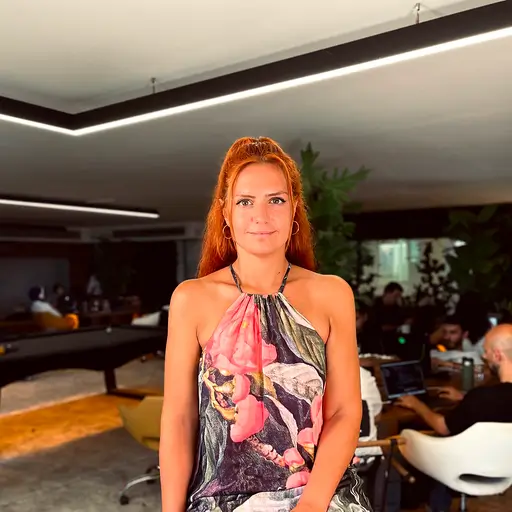
The Neon Apps team of 85 people at the Istanbul office.

The Neon Apps team of 85 people at the Istanbul office.

Build

What did we redesign?

The redesign focused on three main areas: the home screen, watchlists, and the different experience levels and interface states.

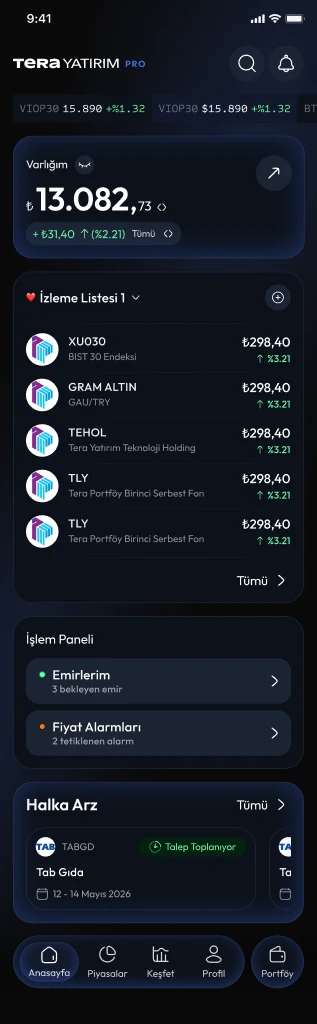
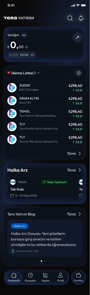
  • The redesigned Tera Trader home screen, leading with the holdings card, then the watchlist, the order panel and the public offerings open for demand
    The home screen
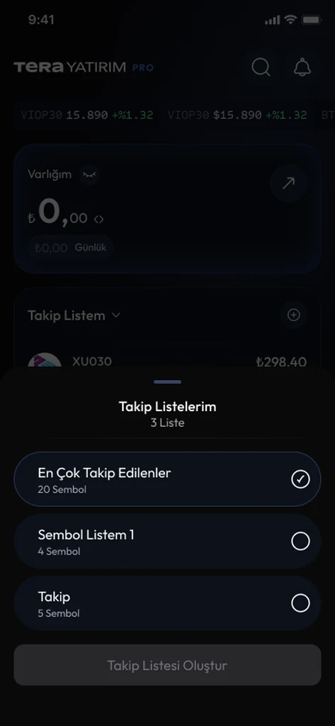
  • The Tera Trader watchlist sheet, listing the customer's three lists with the option to create another
    Switching lists
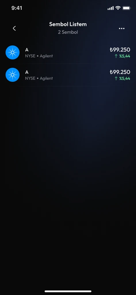
  • A Tera Trader watchlist holding two symbols listed on the NYSE, with the option to add more
    A list, filled
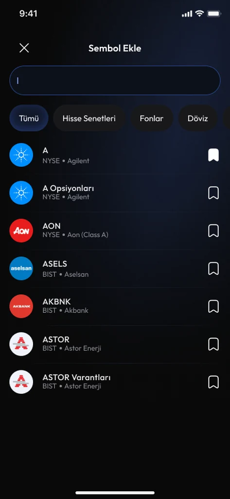
  • Adding a symbol to a Tera Trader watchlist, with the search filtered by instrument type across equities, funds and currencies
    Adding a symbol
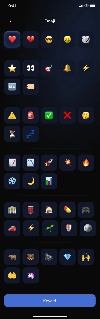
  • The emoji picker in the Tera Trader list builder, with a save button at the foot of the screen
    Choosing an emoji
  • The Tera Trader Lite home screen, carrying the same structure as Pro with fewer panels on it
    Lite
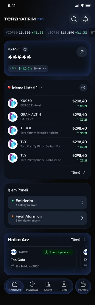
  • The Tera Trader Pro home screen with the balance hidden behind asterisks, the order panel below it showing three pending orders and two triggered alerts
    A hidden balance
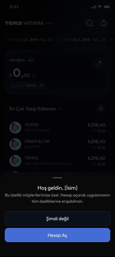
  • The Tera Trader home screen for someone who has not opened an account, with the sheet inviting them to open one
    Restricted access
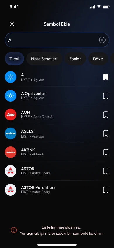
  • Adding a symbol to a full Tera Trader watchlist, with a notice that the list has reached its limit
    The list limit
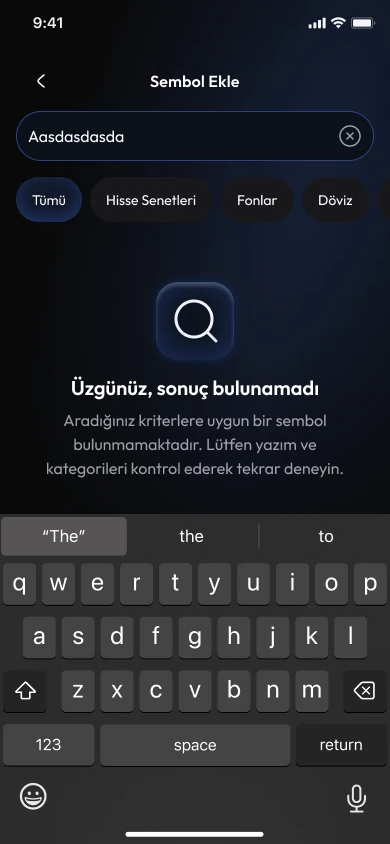
  • A Tera Trader symbol search that returns nothing, with an explanation of what to try next
    No results
01 Home screen

Portfolio first, market second

We reorganized the home screen to make personal investments the starting point. The asset card and hideable balance section are followed by watchlists, the order panel, price alerts and IPO information.

We also designed a panel that allows users to switch between watchlists without navigating away from the home screen, so the instruments on display can change without leaving the same view.

  • The redesigned Tera Trader home screen, leading with the holdings card, then the watchlist, the order panel and the public offerings open for demand
  • The Tera Trader watchlist sheet, listing the customer's three lists with the option to create another
02 Watchlists

A personalized space in a market of thousands of instruments

We created an experience where users can build, name and personalize their watchlists with emojis. The search flow supports filtering by asset categories such as equities, funds and currencies.

By allowing symbols from Borsa Istanbul and international exchanges to appear in the same watchlist, the design enables users to monitor investments across different markets in one place.

  • A Tera Trader watchlist holding two symbols listed on the NYSE, with the option to add more
  • Adding a symbol to a Tera Trader watchlist, with the search filtered by instrument type across equities, funds and currencies
  • The emoji picker in the Tera Trader list builder, with a save button at the foot of the screen
03 Experience levels and interface states

One app, two experiences tailored to different needs

Pro and Lite offer different levels of information density to accommodate varying user preferences and experience levels.

We also designed for everyday scenarios beyond the ideal user journey. Hidden balances, accounts that have not yet been opened, empty watchlists, searches with no results and watchlists reaching their limits were all considered as part of the overall experience.

  • The Tera Trader Lite home screen, carrying the same structure as Pro with fewer panels on it
  • The Tera Trader Pro home screen with the balance hidden behind asterisks, the order panel below it showing three pending orders and two triggered alerts
  • The Tera Trader home screen for someone who has not opened an account, with the sheet inviting them to open one
Technology

More than individual screens: a design system ready for development.

We made the Tera Trader redesign a unified design system rather than a collection of standalone screens. Home screen panels, watchlist rows, cards and interface states were built as reusable components.

This approach allows Pro and Lite, as well as light and dark modes, to be managed through a shared system, so changes to common components can be applied consistently across different versions.

We also included empty lists, restricted access, hidden balances, unsuccessful searches and list limits as part of the design deliverables.

What we appreciated most while working with the Neon Apps team on the new Tera Trader mobile experience was their energy and commitment. They brought a fresh perspective, strong product ownership and a growth-oriented mindset to the project. Despite the unique complexities of the investment industry, their willingness to understand the business, challenge assumptions and quickly turn insights into better user experiences made the collaboration especially valuable to us.

Tevfik Kardelen, Tera Holding
Tevfik Kardelenon LinkedIn

Tera Holding

Team

An experienced mobile product development team

Neon Apps develops mobile products with an in-house team of 85 professionals based in Istanbul and New York. By bringing product, design and engineering teams together, we offer an integrated process from concept to development.

Neon Apps is a mobile app development company based in Istanbul and New York. Since 2019, it has developed iOS, Android and cross-platform products for startups and enterprises. Neon Apps has completed more than 600 projects for over 300 clients. These products have reached 100 million users, with client satisfaction at 98%. Neon Apps is also an official RevenueCat partner, with subscription infrastructure and growth work carried out as part of this partnership.

Browse the full portfolio

Frequently asked questions

Got a project?

Let's Connect

Got a project? We build world-class mobile and web apps for startups and global brands.

Contact us