


Skip to content
Neon Apps
The Protein Ocean and Neon Apps logos locked up together on a deep blue background.

Case study · Protein Ocean

Protein Ocean

We brought Protein Ocean's comprehensive e-commerce experience to mobile.

Protein Ocean's existing website brought the brand's entire shopping experience together in one place. We designed and built the mobile application to cover the same ground, bringing everything from registration and order tracking to the product catalogue, promotional conditions, cart benefits, and order history into the app as its own screens rather than as a window onto the website.

In short

Protein Ocean is a Turkish sports nutrition brand offering protein supplements, creatine, amino acids, vitamins, and functional foods directly to consumers.

The brand's website featured an extensive product catalogue, promotional campaigns, free shipping and gift eligibility thresholds, laboratory certifications, and detailed nutritional information.

At Neon Apps, we designed and built the brand's iOS and Android mobile application, and worked on the backend it runs on. Both platforms come from a single Flutter codebase, and the whole experience is built on one design system, covering registration and login, the home screen, search, categories, product details, cart, checkout, order tracking, and account management.

Our scope also included the app icon and visual assets for the app stores.

The client

Protein Ocean offers protein powders, creatine, amino acids, vitamins, functional foods, and accessories under its own brand.

Selling directly to consumers, the company publishes laboratory analyses of its products and offers various shopping benefits through launch promotions, discount codes, free shipping above certain order values, and gift selection at higher spending thresholds.

Why this project?

An e-commerce experience is about more than just a product catalogue.

How customers discover products, understand promotional conditions, and move from their cart to a completed order are all essential parts of the shopping journey.

Protein Ocean's customers include repeat buyers who already know their preferred products, flavours, and sizes, as well as users who actively follow promotions and special offers. These customers needed to access the features they were familiar with on the website just as easily through the mobile application.

However, bringing a comprehensive website to mobile meant more than simply adapting existing pages to smaller screens.

Features such as eleven flavour options, nutritional information that varies by flavour, a cart that displays progress toward free shipping and gift eligibility, and order tracking through delivery all required an interface designed specifically for mobile interactions.

Project Team

Project Team

Challenge

Bringing a comprehensive shopping experience to smaller screens

We used Protein Ocean's existing website as the starting point for the design process. The challenge was to preserve its full range of functionality without turning the mobile experience into a complicated navigation structure.

  • 01

    A product catalogue with multiple options

    Protein Ocean sells products across eight categories. A single product can offer up to eleven flavours and three size options.

    Customers who know exactly what they want need to find their products as quickly as possible, while those exploring the catalogue should be able to browse categories comfortably.

  • 02

    Promotional conditions that influence purchasing decisions

    Free shipping becomes available at a certain cart value, while gift selection is unlocked at a higher threshold. Discount codes, launch campaigns, and bundle pricing add further conditions to the shopping experience.

    While these details can be displayed across larger sections of a website, they need to be presented clearly within the mobile application, particularly in the shopping cart.

    This allows customers to understand which benefits are available and how much more they need to spend to unlock them.

  • 03

    Making detailed product information accessible

    Product pages contain extensive information, including nutritional values, ingredients that may vary by flavour, usage instructions, laboratory certifications, and up to 12,000 customer reviews.

    Displaying all this information on a single screen could overwhelm users. On the other hand, making it difficult to access could prevent customers from properly evaluating a product.

    The challenge was to make detailed product information easy to find without unnecessarily cluttering the interface.

Approach

How we designed and built it

Rather than starting directly with screen designs, we began by analyzing the brand's existing shopping experience and understanding user needs.

First, we identified the actions customers wanted to complete. We then structured user flows that would allow them to complete those actions in as few steps as possible.

By building every screen around a shared design system, we aimed to create a consistent experience throughout the application.

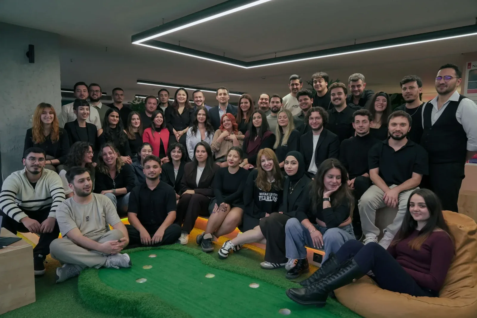
The Neon Apps team of 85 people at the Istanbul office.

The Neon Apps team of 85 people at the Istanbul office.

Process

How the work ran

  1. Phase 01

    Discovery

    We explored Protein Ocean's existing website from the customer's perspective, reviewing the entire shopping experience.

    We analyzed product categories, product information, promotional mechanics, cart conditions, order statuses, and account management features to define the scope of the mobile application.

  2. Phase 02

    Visual direction

    We developed three distinct visual directions, each featuring different colour palettes and typography choices.

    After presenting and comparing these alternatives, a direction combining white surfaces, deep navy tones, and a distinctive orange accent was selected.

    This approach also aligned with the brand's established visual identity across its product packaging.

  3. Phase 03

    Screen design

    We designed the application's user flows from beginning to end.

    Beyond ideal user journeys, we also considered alternative scenarios, including empty carts, searches with no results, account screens accessed without signing in, and different order statuses.

  4. Phase 04

    Build

    The screens were built in Flutter for iOS and Android, so one codebase carries both platforms, with the backend work the app needed running alongside them.

    The app icon and the store assets were prepared alongside them. The listing and the app therefore come out of the same design system.

Deliverables

What we made

We designed and built Protein Ocean's mobile application from end to end, covering the screens customers encounter throughout their shopping journey, the interface states behind them, the design system the whole experience sits on, and the backend it runs on.

  • The iOS and Android app: designed and built on one Flutter codebase, covering registration, login, password reset, home screen, search, categories, product pages, cart, gift selection, checkout, orders, order tracking, favourites, and account management.
  • Alternative interface states: empty carts, searches with no results, account screens accessed without signing in, and different order statuses.
  • Design system: colours, typography, spacing, shared components, and development-ready asset exports.
  • Backend: the server-side work the app needed to run on.
  • App store assets: app icon and visual materials for the App Store and Google Play.
Build

A screen-by-screen look at the experience

We selected ten screens from the app and organized them around the key stages of the customer journey.

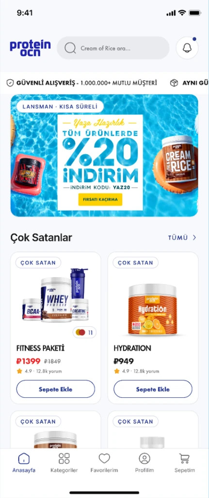
  • The Protein Ocean home screen, with the launch campaign banner above a bestsellers grid and a floating navigation bar
    The home screen
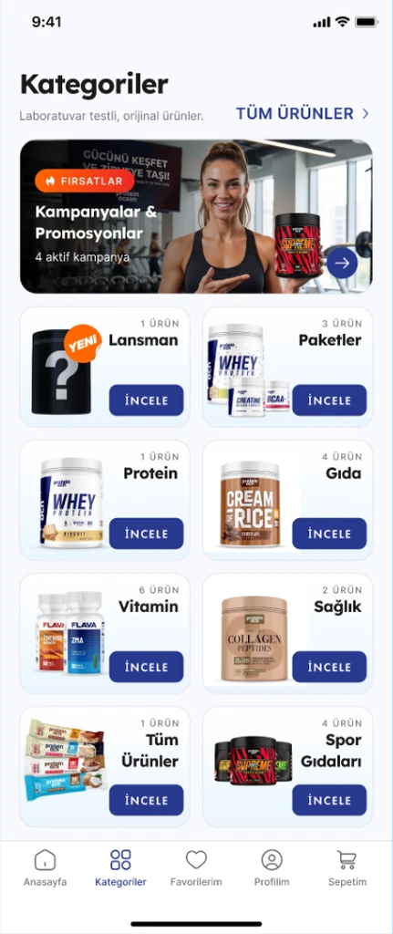
  • The Protein Ocean categories screen, with a campaigns card above eight category tiles that each carry a product count
    Categories, with the size of each shelf
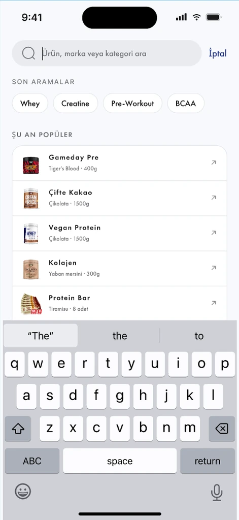
  • The Protein Ocean search screen, with recent searches as chips and a list of popular products with thumbnails
    Search, before anything is typed
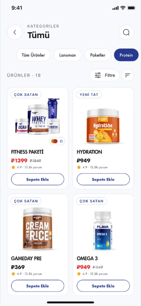
  • The protein category in the Protein Ocean app, filtered with chips above a grid of eighteen products
    A category, filtered in place
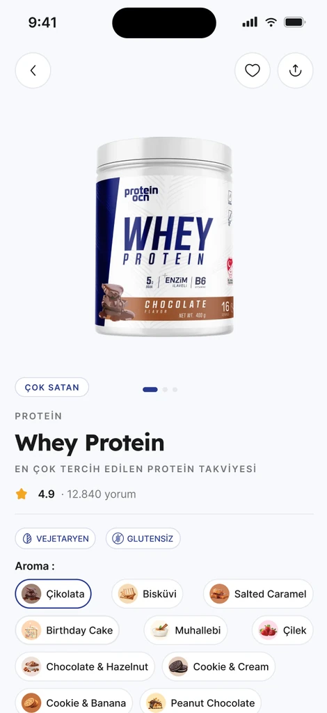
  • A Protein Ocean product page, with the gallery, the rating, the vegetarian and gluten free tags and eleven flavour options
    The product page
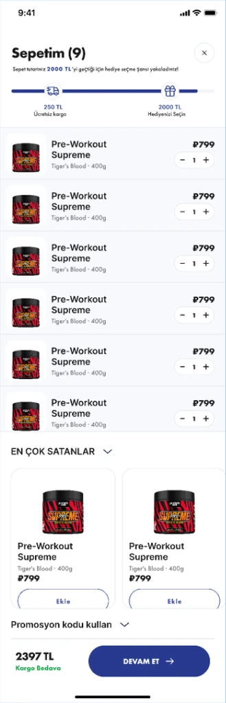
  • The Protein Ocean basket, with a progress bar marking the free shipping and gift thresholds above the line items
    The basket, with both thresholds on it
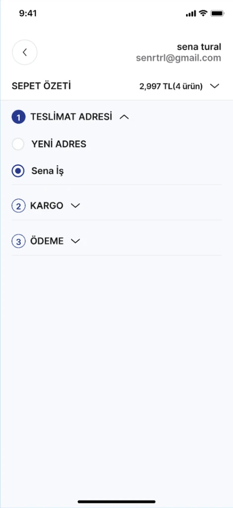
  • The Protein Ocean checkout, with delivery address, shipping and payment as three numbered steps on one screen
    Checkout in three steps
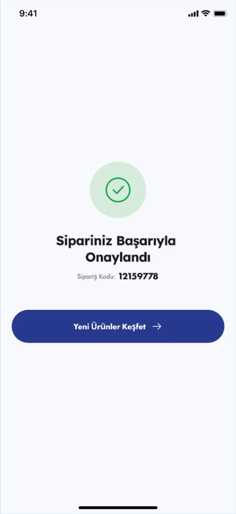
  • The Protein Ocean order confirmation screen, with the order code and a button back into the catalogue
    The order, confirmed
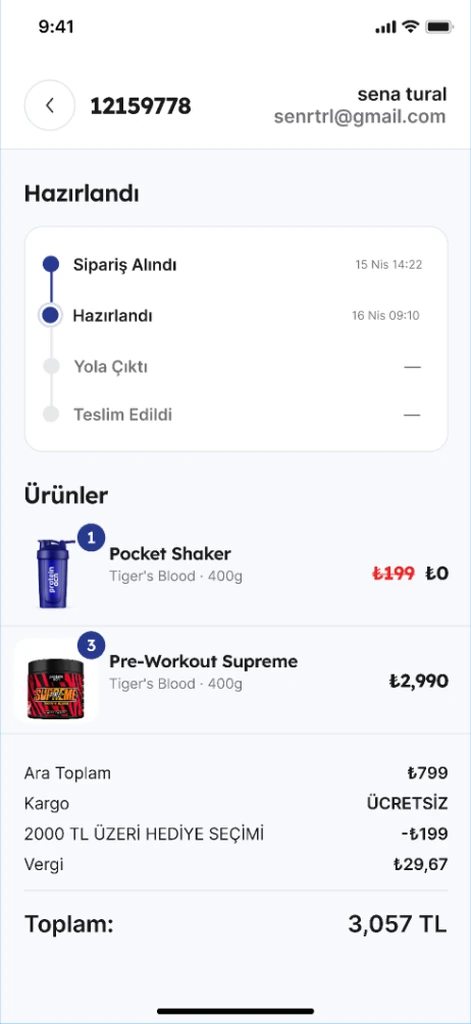
  • A Protein Ocean order detail screen, with a four-step timeline, the items ordered and the price breakdown
    Following the order
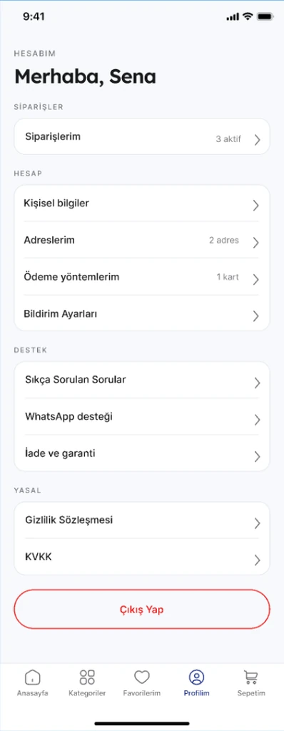
  • The Protein Ocean account screen, listing orders, personal details, addresses, payment methods, support and legal pages
    The account
01 Discovering products

A home screen designed to make shopping easier

We placed current promotions and best-selling products at the forefront of the home screen.

Product cards display promotional badges, the number of available flavours, original and discounted prices, customer ratings, and an add-to-cart button. This allows customers to add familiar products to their carts without opening the product detail page.

We also designed the category screen as a grid displaying the number of products within each category, helping users understand the available selection before entering a category.
  • The Protein Ocean home screen, with the launch campaign banner above a bestsellers grid and a floating navigation bar
  • The Protein Ocean categories screen, with a campaigns card above eight category tiles that each carry a product count
02 Making product selection easier

Eleven flavour options and detailed product information

The search screen presents recent searches and popular products in a layout supported by product imagery. On category pages, filtering options are integrated without disrupting the existing grid layout.

The product detail page prioritizes the gallery, flavour selection, size options, and pricing on the first screen. Nutritional information, usage instructions, laboratory certifications, and customer reviews are placed in expandable sections.

We designed the nutritional information table to update based on the selected flavour, allowing customers to review the relevant nutritional details for each variation.

  • The Protein Ocean search screen, with recent searches as chips and a list of popular products with thumbnails
  • The protein category in the Protein Ocean app, filtered with chips above a grid of eighteen products
  • A Protein Ocean product page, with the gallery, the rating, the vegetarian and gluten free tags and eleven flavour options
03 Purchasing and tracking orders

From cart to delivery

Within the cart, we introduced a progress indicator showing the remaining amount required to qualify for free shipping and gift selection. We also included related product recommendations and an easily accessible promotional code section.

The checkout experience was structured into three numbered steps that users can follow within a single screen.

The order confirmation screen displays the order number, while order tracking uses a visual timeline showing each stage alongside its corresponding time information. The account section brings saved addresses, payment cards, notification preferences, and support options together in one place.

  • The Protein Ocean basket, with a progress bar marking the free shipping and gift thresholds above the line items
  • The Protein Ocean checkout, with delivery address, shipping and payment as three numbered steps on one screen
  • The Protein Ocean order confirmation screen, with the order code and a button back into the catalogue
Technology

Both platforms come from a single Flutter codebase, so a change lands on iOS and Android at the same time.

The app is not a window onto the website. Every screen is the app's own, and the backend behind them was part of the work, which is what lets the catalogue, the campaign rules and the order history behave on a phone the way they do on the web.

All user flows, alternative interface states, and shared components sit in one design system, which is what lets a screen added later match the ones already there.

For the visual identity, we combined white surfaces, deep navy tones, and a distinctive orange accent, set in Inter and Lexend. A fixed bottom navigation bar, the brand's own product photography, and structured category grids make the shopping experience specific to Protein Ocean.

Team

An experienced mobile product development team

Neon Apps develops mobile products with an in-house team of 85 professionals across Istanbul and New York. By bringing product, design, and engineering teams together, the company provides an integrated process from initial concept through development.

Since 2019, Neon Apps has developed iOS, Android, and cross-platform products for startups and enterprises, completing more than 600 projects for over 300 clients. The products developed have reached 100 million users, and the company reports a 98% customer satisfaction rate. Neon Apps is also an official RevenueCat partner, supporting subscription infrastructure and growth initiatives through this partnership.

Browse the full portfolio

Frequently asked questions

Got a project?

Let's Connect

Got a project? We build world-class mobile and web apps for startups and global brands.

Contact us