
Project ManagerSeptember 18, 2026
Why Mobile App Design Determines Your Product’s Success
Design is not decoration. It is the architecture of how your users accomplish goals, and it directly determines whether they stay or uninstall. Apps with poor navigation, inconsistent visual language, or slow-feeling interactions lose users before those users ever reach the core value of the product.
The business stakes are concrete. According to the 2025 State of Mobile report by data.ai, users abandon apps after an average of one to three sessions when the experience fails to deliver clear value quickly. For enterprise products, that abandonment translates into adoption failure, which kills the ROI of the entire development investment. For startups, it means burning runway on a product that never finds traction.
Good design solves three problems at once: it reduces cognitive load for users, it aligns the product with business objectives, and it gives developers a precise, buildable specification. Every phase in this guide is structured around those three outcomes.
Define Your Goals, Audience, and Core Use Cases First
Before any screen is sketched, the team needs answers to three questions: who is this for, what do they need to accomplish, and what does the business need the product to do?
This is the discovery phase, and skipping it is the most expensive mistake in mobile product development. Teams that jump straight to visual design routinely build the wrong screens beautifully.
A structured discovery phase covers:
User personas built from real research, not assumptions, describing goals, context, and frustrations
Business objectives mapped to measurable outcomes, such as transaction completion rate or session frequency
Core use cases ranked by priority, so the design effort concentrates on the workflows that matter most
Competitive audit of two to four comparable products to identify conventions worth following and gaps worth exploiting
The output of this phase is a shared brief that the designer, product manager, and engineering lead all sign off on. Without it, every subsequent design decision becomes a negotiation instead of a reference.
Map Out User Flows and Information Architecture
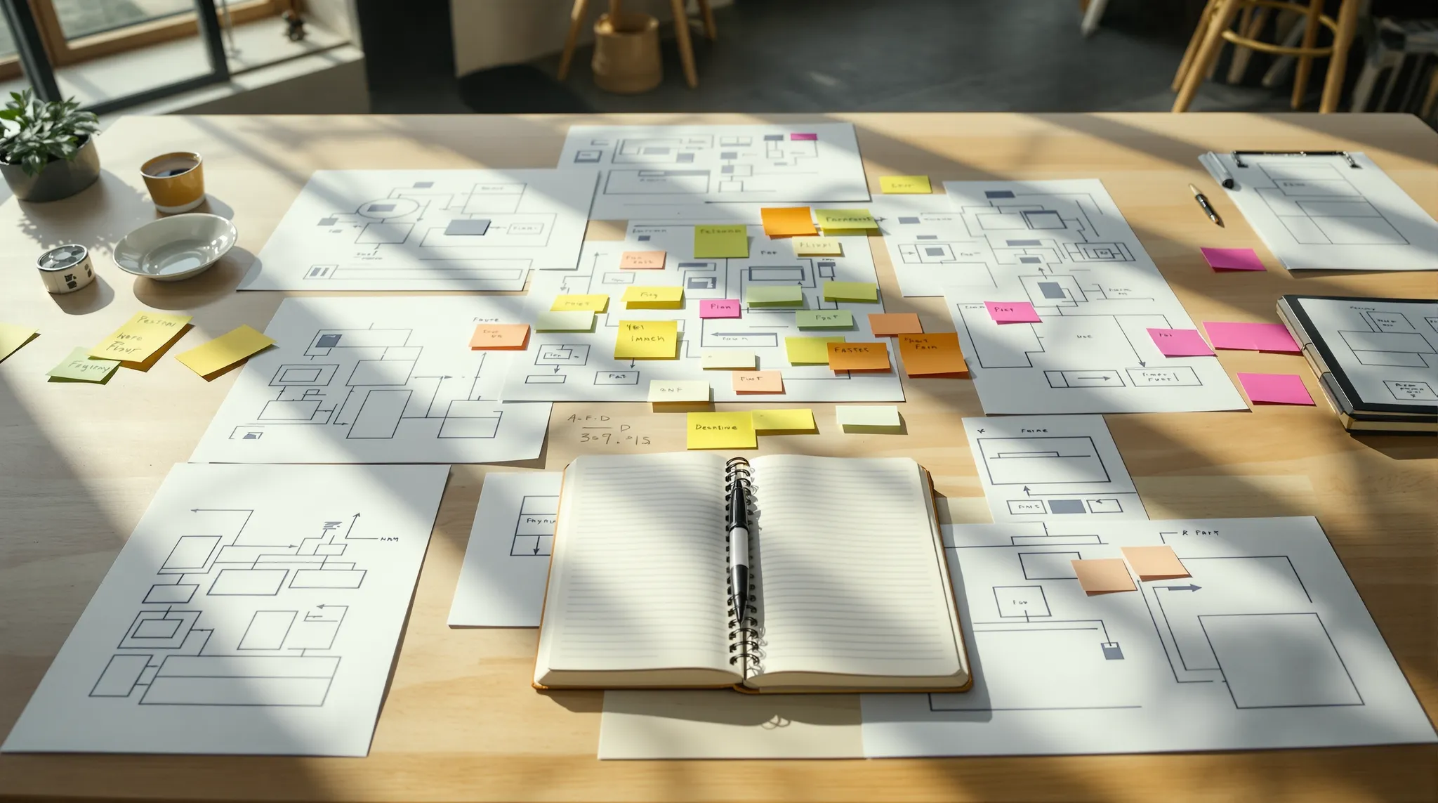
User flows and information architecture (IA) define the skeleton of the app before any interface is designed. A user flow is the sequence of steps a user takes to complete a specific task. IA is the overall structure that organizes every screen and content type into a navigable hierarchy.
Getting these right prevents the most common structural failure in mobile apps: users cannot find what they came for.
A practical approach:
List every core use case from the discovery phase and draw the step-by-step path a user takes to complete each one
Identify where paths converge (shared screens like a profile or settings) and where they branch (role-based or permission-based views)
Choose a primary navigation pattern, tab bar for iOS, bottom navigation for Android, and validate it against the number of top-level sections
Map the full screen inventory so the team knows the total scope before wireframing begins
Navigation Pattern | Best For | Tradeoff |
Tab bar (iOS) | 3 to 5 top-level sections | Limited to five tabs maximum |
Bottom navigation (Android) | Frequent switching between sections | Competes with gesture navigation |
Hamburger drawer | Large, infrequent section sets | Hides navigation from casual users |
Stack-based (drill down) | Linear task flows | No cross-section movement |
A clear IA at this stage means wireframing is faster, prototyping is more accurate, and developer estimates are more reliable.

From Wireframes to Interactive Prototypes: A Step by Step Process
Wireframing is the phase where abstract flows become concrete screen layouts. It is the fastest and cheapest way to make structural decisions before any visual design or code is written.
The process moves through three fidelity levels:
Low fidelity: rough sketches or grayscale boxes that define layout zones, content hierarchy, and primary interactions. Paper or a whiteboard is fine at this stage.
Mid fidelity: digital wireframes in Figma or Sketch that establish spacing, component placement, and navigation patterns. These are precise enough for internal review but carry no visual styling.
High fidelity prototype: screens with real typography, color, imagery, and micro-interactions, connected into a clickable flow that simulates the actual experience.
The transition from mid to high fidelity is where most of the visual design work happens. Each screen gets its component library applied, spacing tokens set, and interaction states defined (default, hover, pressed, disabled, error).
The clickable prototype is the artifact that gets tested with real users before any development begins. It is also the primary reference document for the engineering team during build.
A prototype that takes two weeks to build will catch problems that would take two months to fix in production.
Core UI Design Principles Every Mobile App Must Follow
Professional UI/UX design is governed by a set of principles that apply regardless of industry or platform. Ignoring them produces interfaces that feel unpolished even when the visual style is strong.
Typography works on a scale. Body text on mobile sits between 15 and 17 points. Headings use weight and size contrast, not just size, to establish hierarchy. Line height for body copy lands at 1.4 to 1.6 times the font size for comfortable reading on small screens.
Color systems start with a primary palette of three to five colors, each with a defined role: brand, action, background, surface, and error. Every color pair used for text on a background must meet WCAG AA contrast at minimum, which is a 4.5:1 ratio for normal text.
Touch targets are non-negotiable. Apple’s Human Interface Guidelines specify 44 by 44 points as the minimum tappable area. Google’s Material Design specifies 48 by 48 density-independent pixels. Elements smaller than these thresholds generate consistent tap errors, especially for users over 40.
Spacing follows a base unit, typically 4 or 8 points, and every margin, padding, and gap value is a multiple of that unit. This creates visual rhythm and makes the design system predictable for developers.
Platform conventions matter. iOS and Android users have different learned expectations for navigation gestures, button placement, and modal behavior. A design that ignores these conventions forces users to relearn basic interactions.
Design Element | iOS Convention | Android Convention |
Primary navigation | Tab bar at bottom | Bottom navigation bar |
Back gesture | Swipe right from left edge | System back gesture or button |
Floating action | Less common | FAB (floating action button) |
Typography system | SF Pro | Roboto |
Modal dismiss | Swipe down | Back gesture or close button |
Tools and Software Used by Professional App Designers
The tool does not make the designer, but the right tool for the right phase makes the process significantly more efficient.
Figma is the current industry standard for mobile UI design and the tool used by the majority of professional product teams. It runs in the browser, supports real-time collaboration, and has a component and variable system that maps directly to how developers build design systems. For teams working across design and engineering, Figma’s developer mode surfaces specs, tokens, and asset exports without requiring a separate handoff tool.
Sketch remains in active use at teams with established macOS-only workflows and a large library of existing Figma-incompatible assets. Its plugin ecosystem is mature, but its collaboration model requires third-party tools like Abstract or Zeplin.
Adobe XD is largely in maintenance mode following Adobe’s acquisition of Figma, later blocked by regulators. Most teams that relied on XD have migrated to Figma.
For prototyping beyond Figma’s native capabilities, ProtoPie handles complex conditional interactions and sensor-based prototypes that static tools cannot replicate. It is the right choice when the prototype needs to simulate real device behavior for usability testing.
Figma AI and tools like Galileo AI and Midjourney are increasingly used in early ideation to generate mood boards and rough layout concepts. They accelerate exploration but require a trained designer to evaluate and adapt the output. They do not replace the structural thinking that produces a usable product.
Usability Testing: How to Validate Your Design Before Development
Usability testing is the phase where assumptions meet reality. It involves putting the clickable prototype in front of real users and observing how they interact with it, where they get confused, and what they cannot find.
The goal is not to confirm that the design is good. The goal is to find the problems that are invisible to the team because the team already knows how the product works.
Effective usability testing at the prototype stage follows a structured approach:
Recruit five to eight participants who match the target persona. Research by the Nielsen Norman Group consistently shows that five users uncover the majority of critical usability issues.
Write task scenarios, not instructions. “Find a way to send money to a contact” is a task scenario. “Tap the transfer button” is an instruction that defeats the purpose of the test.
Observe without intervening. Note where users pause, backtrack, or express confusion. These moments are the data.
Debrief after each session and tag findings by severity: critical (blocks task completion), major (causes significant friction), and minor (cosmetic or preference-based).
Critical findings get fixed before development starts. Major findings get prioritized in the first iteration. Minor findings go into the backlog.
Remote testing tools like Maze and Useberry allow unmoderated testing at scale, which is useful for validating specific flows with larger sample sizes after the moderated sessions have resolved the structural issues.

Handing Off Designs to Developers Without Losing Quality
The handoff is where design intent is most at risk. Without a structured handoff process, developers make interpretation calls on spacing, color values, and interaction behavior that silently diverge from the design.
A professional handoff package contains four elements:
Component documentation: every component in the design system described with its variants, states, and usage rules. Developers need to know not just what a component looks like but when to use it and what it does in edge cases.
Specs and tokens: exact values for spacing, typography, color, border radius, and elevation, ideally exported as design tokens that map directly to the codebase. Figma’s developer mode surfaces these automatically for teams using a variable-based design system.
Asset exports: icons, illustrations, and images exported at the correct resolutions and formats for each platform. SVG for icons on both platforms, 1x/2x/3x PNG for raster assets on iOS, and the appropriate density buckets for Android.
Interaction annotations: notes on animation timing, transition types, gesture behaviors, and any state changes that are not self-evident from the static screens.
For teams building with Flutter or React Native, a well-structured Figma component library maps closely to the widget and component structure in code. This alignment reduces the gap between design and implementation and makes the mobile app development process faster and more predictable.
Weekly design-to-development syncs during the build phase catch drift early. A developer who builds a component differently from the spec should flag it in the same sprint, not at QA.
When to Work With a Professional App Design Partner
Some product teams have the internal capacity to execute every phase described in this guide. Many do not, and the gap between “we have a designer” and “we have a mobile product design process” is significant.
The scenarios where an external design partner delivers better ROI than in-house design are specific:
Enterprise complexity: products with multiple user roles, deep integrations with internal systems, and compliance requirements need designers who have built in those constraints before. A team that has shipped banking apps, airport operations tools, or healthcare platforms brings pattern recognition that an in-house generalist designer cannot develop on a single project.
Tight timelines: a structured agency runs discovery, IA, wireframing, and prototype in parallel tracks with dedicated resources. A small in-house team running design alongside product management and engineering rarely matches that pace.
Platform breadth: products that need to ship on iOS, Android, and web simultaneously require a design system that scales across all three. Building that system correctly from scratch takes experience that most single-platform in-house designers have not accumulated.
First product: founders and CTOs building their first mobile product benefit from a partner who has seen what works and what fails across many products and industries. The cost of learning those lessons through iteration is higher than the cost of the partnership.
The right agency functions as an extension of the product team, not a vendor executing a brief. Discovery is collaborative, feedback loops are tight, and the handoff is a knowledge transfer, not a file drop.